USA Risk estimates by county

This map shows the risk level of attending an event, given the event size and location.
The risk level is the estimated chance (0-100%) that at least 1 COVID-19 positive individual will be present at an event in a county, given the size of the event.

Reduce the risk that one case becomes many and:
Wear a mask
Get tested
Get vaccinated
Social distance
Meet outside...
..or ventilate

Choose an event size and ascertainment bias below
See our data sources
Based on seroprevalence data and increases in testing, by default we assume there are four times more cases than are being reported (4:1 ascertainment bias). In places with less testing availability, that bias may be higher. We are evaluating the inclusion of lower ascertainment biases based on increased testing.

Higher vaccination levels reduce the risk that exposure to COVID-19 will lead to severe disease and onward transmission. We show an optional layer representing county-level population immunity via vaccination (allowing for two weeks for individuals completing a vaccination series).

We have stopped updating the data for this application due to reporting changes and declining test volumes. Soon you'll be able to explore Covid's ebb and flow over time, but for now the data is frozen at December, 27, 2022

(Note: This map uses a Web Mercator projection that inflates the area of states in northern latitudes. County boundaries are generalized for faster drawing.)

Risk Quiz

Can you guess the risk levels in your community? Take the quiz to find out, and share your high score.

Fill out this 5-minute survey for a chance to win a $50 Amazon gift card!

Imagine a coffee shop in your area with 20 people inside. What's the probability that at least one of the people is infected with COVID-19?

Imagine a grocery store in your area with 50 people inside. What's the probability that at least one of the people is infected with COVID-19?

Imagine a movie theater in your area with 100 people inside. What's the probability that at least one of the people is infected with COVID-19?

Imagine a graduation ceremony in your area with 1000 people inside. What's the probability that at least one of the people is infected with COVID-19?

Tutorial:

As many parts of the United States begin to lift shelter-in-place, it’s crucial for us to be able to estimate the risks involved with resuming non-essential activities, particularly those involving large crowds. The COVID-19 Risk Assessment Planning tool can be used to explore the risk that at least one person at an event of a certain size is currently infected with COVID-19, given a certain number of circulating infections in the specified region.

Our risk calculations tell you only how likely it is that at least one person at any event of a given size is infectious. This is not the same as the risk of any person being exposed or infected with COVID-19 at the event

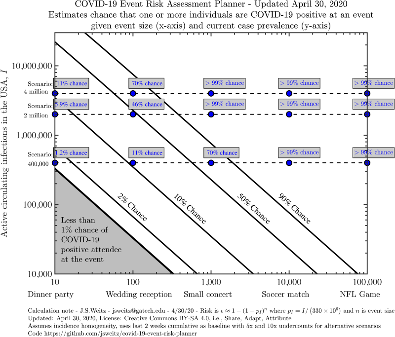
We define circulating cases (people who are currently infectious) as cases reported in the past ten days. Note that real-time risk assessments prior to August 14th used a fourteen day window. The choice of a reduced duration is consistent with CDC advice on the duration of typical infectous periods (though we recognize that individuals may shed longer). We correct for under-reporting by multiplying by an ascertainment bias. Based on seroprevalence data, we suspect that in many parts of the US this is around 10:1 (i.e., ten total cases for every one reported), but this rate may vary by location, and we also include a 5:1 ratio on the main page. Cases may be under-reported due to testing shortages, asymptomatic “silent spreaders,” and reporting lags.

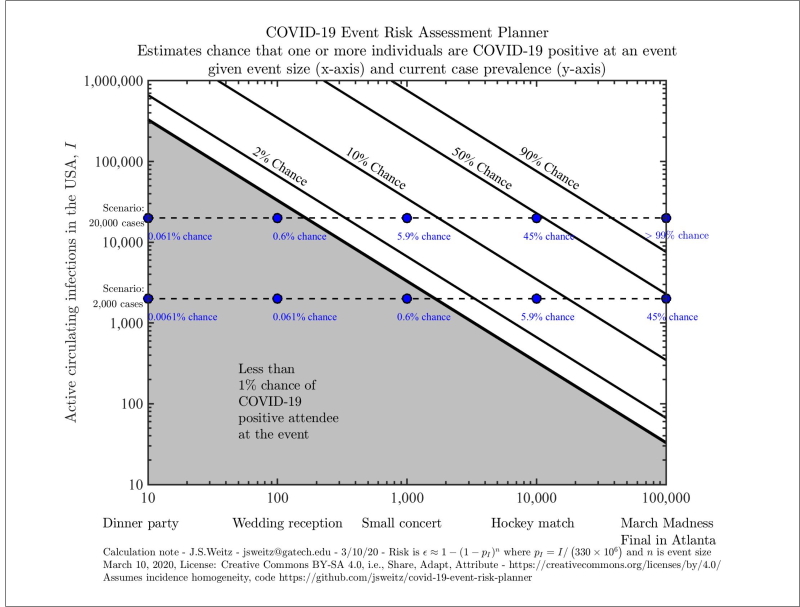
Our tool generates figures that look like this.

COVID-19 Event Risk Assessment Planner - US - Exploratory

Please note that our axes are given on a logarithmic scale, so moving up by one tick means multiplying that variable by ten. The diagonal lines divide the chart into risk levels. For example, all scenarios between the orange and red lines involve a 10-50% risk that someone with COVID-19 is present. The grey region indicates scenarios with a less than 1% chance that someone with COVID-19 is present. We give you exact values for a few preset scenarios in the blue boxes. In this example, we also see a 48.7% chance (red dot ) that someone has COVID-19 at an event with 275 attendees if 800,000 cases are circulating in the US.

You can get exact values for your own scenario using the Explore US and State-level estimates tab. You can generate a risk assessment planner for the entire country or focus on a particular state (this will just change our estimate of the total population size and the proportion of people who are infected).

When you input the number of circulating cases, it’s important that you include only those that are currently infectious. This is different from the total number of cases reported because people infected several weeks ago are likely no longer contagious. It’s also likely that we’re only detecting a fraction of cases due to testing shortages, reporting lags, and asymptomatic “silent spreaders.” A rough calculation you can do is to take the past week or two of reported cases and potentially multiply it by some constant (for example, five or ten) to correct for the virus’ ongoing spread and the proportion of cases you think may be undetected.

Otherwise, we’ve done that calculation for you in the Real Time US and State-level estimates tab. The horizontal dotted lines with risk estimates are based on real-time COVID19 surveillance data. They represent, estimates given the current reported incidence (circle ), 5 times the current incidence (triangle ), and 10 times the current incidence (square ).

Notes on Usage and Interpretation:

Please feel free to share any plots that you generate (we’ve provided a Download button). We’d love for you to use this as a tool to educate your community and weigh the risks of holding certain events right now. You can see how this tool is already being used in the Press tab.

Here’s a sample tweet to accompany the graphic:

Today's #COVIDRisk in GA: if 275 people are at a indoor music venue, there's a **X%** chance someone has #COVID19. Learn more at https://covid19risk.biosci.gatech.edu

All of our calculations are necessarily estimates, based on imperfect data. We can’t tell you the probability that someone in the event will get infected. It’s important to remember that a certain amount of chance is involved in these outcomes. We’d encourage large event planners to exercise caution in the coming months, especially given the potential for one infected person to transmit the virus to many others in one super-spreading event (Biogen conference, Atalanta-Valencia soccer match, Washington choir practice).

As a final note, there is a moderate to high risk of being exposed to COVID-19 in many parts of the US right now. You can reduce your risk of getting infected or infecting someone else by practicing social distancing, wearing masks when out of your home, hand-washing, and staying home when you feel sick. Learn more on how to minimize your individual risk at https://www.cdc.gov/coronavirus/2019-ncov/prevent-getting-sick/prevention.html.

How we do our calculation:

What is the chance that one person at this event will already be infected with COVID-19? To answer this kind of question, we actually calculate the opposite. For example, if we were talking about a NFL game, we’d ask what is the chance that none of the 75,000 attendees is infected?

Let’s start by thinking about just one of them. If 20,000 of the 330 million people in the United States are sick, then each person has a 99.994% chance of being disease-free. In betting terms, the odds are 16,500:1 in our favor. While that sounds good from an individual perspective, the collective risk is very different.

In this scenario, the probability that all 75,000 attendees would have entered the stadium disease-free is like placing 75,000 bets each at nearly certain odds. Sure, you’ll win most of the bets. But the probability that you will win every single one of those bets is extremely low. To calculate it, we multiply the winning probability (1-1/16500) by itself 75,000 times and find that there is approximately a 1% chance that we win every time. In other words, the chances that one or more attendees would have arrived infected with SARS-CoV-2 is 99%.

About

This site provides interactive context to assess the risk that one or more individuals infected with COVID-19 are present in an event of various sizes. The model is simple, intentionally so, and provided some context for the rationale to halt large gatherings in early-mid March and newly relevant context for considering when and how to re-open. Precisely because of under-testing and the risk of exposure and infection, these risk calculations provide further support for the ongoing need for social distancing and protective measures. Such precautions are still needed even in small events, given the large number of circulating cases.

Contributors:

Conceptual Development

  • Joshua Weitz (Georgia Institute of Technology, Biological Sciences, GT-BIOS)

Website and Dashboard Development

Risk Expansion Development

Funding

  • Ongoing support for the project is via the Centers for Disease Control and Prevention (75D30121P10600)
  • Initial funding for the project made possible by support from the Simons Foundation 329108, Army Research Office W911NF1910384, National Institutes of Health 1R01AI46592-01, National Science Foundation 1806606, 1829636 and 2032084).
  • Additional support of the project from the Charities in Aid Foundation and The Marier Cunningham Foundation.

Institutional Review Board (IRB)

The Institutional Review Board (IRB) at Georga Tech and Duke University have reviewed the protocol for collecting user data from this site via surveys and risk prediction quizzes. Approvals were granted effective August 27, 2021 and classified as ‘Minimal risk research qualified for exemption status’. For more information please contact the Office of Research Integrity Assurance, Georgia Institute of Technology, irb.gatech.edu.

Acknowledgements

The team thanks Richard Lenski, Lauren Meyers, and Jonathan Dushoff for input on concept development.

International Collaborations

Italy: http://datainterfaces.org/projects/covid19eventi/
Spain: https://eventosycovid19.es

How to cite

Chande, A., Lee, S., Harris, M. et al. Real-time, interactive website for US-county-level COVID-19 event risk assessment. Nat Hum Behav (2020). https://doi.org/10.1038/s41562-020-01000-9

Chande, A.T., Gussler, W., Harris, M., Lee, S., Rishishwar, L., Hilley, T., Jordan, I.K., Andris, C.M., and Weitz, J.S. ‘Interactive COVID-19 Event Risk Assessment Planning Tool’, URL http://covid19risk.biosci.gatech.edu/

Weitz, J.S., Harris, M., Chande, A.T., Gussler, J.W., Rishishwar, L. and Jordan, I.K. (2020) Online COVID-19 Dashboard Calculates How Risky Reopenings and Gatherings Can Be. Sci Am. https://blogs.scientificamerican.com/observations/online-covid-19-dashboard-calculates-how-risky-reopenings-and-gatherings-can-be/

Code and model:

https://github.com/jsweitz/covid-19-event-risk-planner
https://github.com/appliedbinf/covid19-event-risk-planner
https://figshare.com/articles/COVID-19_Event_Risk_Assessment_Planner/11965533

March 10, Tweet Thread:

https://twitter.com/joshuasweitz/status/1237556232304508928?s=20

Op-Ed (w/Richard Lenski, Lauren A. Meyers, and Jonathan Dushoff):

https://www.ajc.com/blog/get-schooled/scientists-the-math-show-how-large-events-like-march-madness-could-spread-coronavirus/g1pVdzQgJS5aoPnadBqyXO/

LA Times

WIRED Science

Boston Globe

WebMD

Healthline

Bloomberg - Map Lab

San Francisco Chronicle

GVWire

ABC7 San Francisco

NBC 7 San Diego

SFGate

Boston.com

The Salt Lake Tribune

MassLive

Politico

Wired

KARE 11

KUTV

The Daily Memphian

Georgia Tech College of Sciences

Newsweek

FOX5 Atlanta:

Slate:

Wired:

Nature:

National Geographic:

Atlanta Magazine:

NPR - Cross Cut:

United States of America

Released: July 7, 2020

COVID19 data

Real-time COVID19 data comes from the COVID Tracking Project: https://covidtracking.com/api/

Real-time county level COVID19 data comes from the NYTimes COVID19 data project: https://github.com/nytimes/covid-19-data

Population data

US 2019 population estimate data comes from the US Census: https://www.census.gov/data/tables/time-series/demo/popest/2010s-state-total.html

Vaccination data

County-level vaccination coverage is collated by the Bansal lab at https://www.vaccinetracking.us/. We linearly interpolate between weekly values and merge county data to account for geographic exceptions in Alaska (Hoonah-Angoon plus Yakutat; Lake Peninsula plus Bristol Bay) and in New York City (New York, Kings, Queens, Bronx plus Richmond) following the New York Times dataset. Joint vaccination levels are computed for the City of Joplin, Jasper County, and Newton County, Missouri and for Kansas City, Jackson County, Clay County, Cass County, and Platte County, Missouri.

Merritt, Alexes; Tiu, Andrew; Bansal, Shweta, 2021, “Integrated US COVID-19 Vaccination Data”, https://doi.org/10.7910/DVN/BFRIKI, Harvard Dataverse, V1.

Andrew Tiu, Zachary Susswein, Alexes Merritt, Shweta Bansal. Characterizing the spatiotemporal heterogeneity of the COVID-19 vaccination landscape. medRxiv. https://doi.org/10.1101/2021.10.04.21263345

United Kingdom

Released: October 5, 2020

The Coronavirus (COVID-19) in the UK API from Public Health England and NHSX: https://coronavirus.data.gov.uk

Italy

Released: October 5, 2020

Italian Department of Civil Protection COVID-19 Data: https://github.com/pcm-dpc/COVID-19/

Italian maps: http://datainterfaces.org/projects/covid19eventi/

Switzerland and Liechtenstein

Released: October 5, 2020

(from October 5, 2020 - December 19, 2021) Specialist Unit for Open Government Data Canton of Zurich COVID-19 data: https://github.com/openZH/covid_19 (from December 19, 2021): Federal Office of Public Health FOPH: https://www.covid19.admin.ch/en/overview

Austria

Released: October 19, 2020

Federal Ministry for Social Affairs, Health, Care and Consumer Protection (BMSGPK) data on COVID-19 for Austria: https://www.data.gv.at/covid-19/

France

Released: October 19, 2020

Santé publique France COVID-19 data for France : https://www.data.gouv.fr/fr/datasets/donnees-relatives-aux-resultats-des-tests-virologiques-covid-19/
Note this resource also contains data for overseas departments of France, and for Saint Barthélemy, Saint Martin, and Saint Pierre and Miquelon.

Czech Republic

Released: October 27, 2020

COVID-19 data sourced from National Health Information System, Regional Hygiene Stations, Ministry of Health of the Czech Republic and prepared by the Institute of Health Information and Statistics of the Czech Republic and the Institute of Biostatistics and Analyses, Faculty of Medicine, Masaryk University: https://onemocneni-aktualne.mzcr.cz/covid-19

Komenda M., Karolyi M., Bulhart V., Žofka J., Brauner T., Hak J., Jarkovský J., Mužík J., Blaha M., Kubát J., Klimeš D., Langhammer P., Daňková Š ., Májek O., Bartůňková M., Dušek L. COVID 19: Overview of the current situation in the Czech Republic. Disease currently [online]. Prague: Ministry of Health of the Czech Republic, 2020. Available from: https://onemocneni-aktualne.mzcr.cz/covid-19 . Development: joint workplace of IHIS CR and IBA LF MU. ISSN 2694-9423.

Ireland

Released: October 27, 2020

Data is provided by the Health Service Executive (HSE), Health Protection Surveillance Centre (HPSC), The Central Statistics Office (CSO) and Gov.ie and accessed via Ireland’s COVID-19 Data Hub: https://covid19ireland-geohive.hub.arcgis.com/

Spain

Released: October 27, 2020

COVID-19 data from España Ministerio de Sanidad and Instituto de Salud Carlos III: https://cnecovid.isciii.es/covid19/

Denmark

Released: November 22, 2020

COVID-19 data from the Statens Serum Institut (SSI):

Sweden

Released: November 22, 2020

Swedish COVID-19 National Statistics from Folkhälsomyndigheten: https://experience.arcgis.com/experience/09f821667ce64bf7be6f9f87457ed9aa/page/page_0/

Albania, Andorra, Belarus, Belgium, Bosnia and Herzegovina, Bulgaria, Croatia, Cyprus, Estonia, Finland, Germany, Greece, Hungary, Iceland, Israel, Latvia, Lithuania, Luxembourg, Malta, Moldova, Monaco, Montenegro, Netherlands, Norway, Poland, Portugal, Northern Macedonia, Romania, San Marino, Serbia, Slovakia, Slovenia, Turkey, Ukraine; and Gibraltar, Guernsey, Jersey, Isle of Man, Faroe Islands, Greenland

Released: December 19, 2021

We use data aggregated from local health resources in the WHO European Region COVID19 Subnational Explorer: https://experience.arcgis.com/experience/3a056fc8839d47969ef59949e9984a71


The COVID-19 Event Risk Assessment Planning Tool is a collaborative project led by Prof. Joshua Weitz and Prof. Clio Andris at the Georgia Institute of Technology, along with researchers at the Applied Bioinformatics Laboratory, Duke University, and Stanford University, and powered by RStudio. Description of the method and analyses available at Nature Human Behaviour.

Ongoing support for the project is via the Centers for Disease Control and Prevention (75D30121P10600), Charities in Aid Foundation, The Marier Cunningham Foundation, and the Rockefeller Foundation Pandemic Prevention Institute.